Friday, May 7, 2010

This is How it Starts: Making Buttons, the Beginning of an Addiction

A scarf that I am in the process of finishing calls for buttons and since I wanted really great and folksy buttons for it I began a search on Etsy. After quite some time of searching though, and despite some pretty great offerings on Etsy, I had not found any buttons that I felt were super perfect for my scarf and so I began to wonder, "could I possibly make these buttons myself?"

Though I had admired cloth covered buttons for some time, and have bought them a few times, I never really thought about how they were put together until I used them in jewelery. I decided to use one of the buttons I had bought, for a project gone awry, to make a necklace and when I popped the back off I realized that it was just cloth pushed down into the back of the button. Nothing fancy. So, when the thought began to creep into my mind that perhaps I should make these buttons myself it didn't take long for me to jump into action.

First I searched for instructions on the process, but I honestly found it hard to follow the written ones. Thus, I moved onto searching videos. Many videos on the process seemed to over-complicate the matter and were pretty long. I finally found one though that was very straightforward and was amazed at how easy the whole thing looked.

Therefore, with my new found enlightenment I went on the hunt for fabric and button making kits. Finding the fabric actually took me a while because now not only was I looking for a great fabric to match my scarf, but also a fabric that would introduce me to the act of making buttons...it had to be special. In the process of searching for fabric I was introduced to Fabric.com where I ended up ordering a simple and yet colorfully cute yard of fabric. I then went onto Etsy again and purchased a couple button making kits, one in 7/8 of an inch and one in 1/2 of an inch.

As soon as I got my fabric I began the exciting endeavor of making my very own buttons!!!

Supplies:


The first thing to do was to cut off a section of fabric that had a few different color flowers I could use.

The lucky piece:


Once that was done I needed to further cut the fabric so that I had a square with the color flower I wanted in the center.

The first color:


After this was done I went about placing the fabric in the correct position on the button. In the video he places the fabric in the...um I don't really know the word for it, but I will say...button well. I did it a little differently though. I placed the fabric over the front of the button and stretched a little while placing the button in the button well.

New term - Button Well:


Next you cut down any excess fabric and push it down into the back of the button, as shown in the video, and then place the back down and press it in with the back presser thingy (my terminology is outstanding I know). Once done just pop the button out and walah!

My First-ever Button!!:


As I went along I was better able to center the fabric, after all practice makes perfect, and I ended up with a product that made me really happy!

Buttons after some Practice:


I also made smaller buttons that I think match the scarf a little better.

All the Buttons from the Evening:


I really cannot wait to make more buttons with tons of different fabrics and flat backs as well as wire backs! All day I haven't been able to shut up about how much fun I had doing this and how very easy it is! A couple of things I realized in the process though are:
1) Don't worry if the placing isn't exactly right at first, you can pop the back off pretty simply and re-position the fabric as needed
2) Cutting off more fabric than needed is always better than underestimating. I was really scared at first to cut a lot because I didn't want to waste such pretty fabric, but once I realized that my underestimating was causing me to actually use more fabric I just cut out bigger blocks and it turned out great!

So, go crazy and have fun...and be sure to come back to see how the scarf turned out!

Tuesday, May 4, 2010

I never said I was Anything Special: The Tale of an Easy, yet Fun Card

As the title of this post might indicate the project I am about to outline is not that amazing, it is just fun. It is an easy way to send someone a card that shows you really took the time out of your day to think about them. The card is simple enough, use some stamps and yarn to create a personalized image with a nice bow tie to top it off! I will go ahead and show the end result to start with so that you know what you might be getting into if you want to make this, although as has been stated you can create any image you want to.

End Result:


The supplies I used for this were:

1. Cardstock - since I don't have a paper cutter at home I am lazy and buy this, but it is easy enough to make. I find the colors and varieties at Kate's Paperie great though and I love to mix and match, using one color for the card and another for the envelope.


2. STAMPS!! and acid free Ink - Despite what some might think, just because I love letterpress doesn't mean I don't love stamps. Stamps are so much fun because you can use them at home as a quick, easy, and enjoyable way to add flair to almost anything and create something new and original. I have so far gotten all of my limited supply of stamps from the Ink Pad and I can't see myself purposefully going anywhere else in NYC. The store itself is so small but it is packed full of great products. This card was for my mom who loves dragonflies and so I went out and got what I thought to be a lovely dragonfly stamp, just for this card, and added to it a couple other stamps I already had.


3. Yarn and Needle - I simply used a bit of yarn I already had laying around that I thought would match the card I was making...you can of course use string or anything like that. I also just used a tapestry needle to thread it through. I did get a bit too fancy with it by using a template I had gotten from an artist's book class in order to punch the holes, but I think it is pretty clear that this project is too simple to really worry about that.


Using this fancy template I was able to do a figure eight threading to give it a little oomph.


Once the yarn was tied in the middle I simply trimmed it down and made a bow.

So, I think it is pretty clear that all I really did here was go stamp crazy and then thread through the top of the card with pretty yarn and blamo! I got a card that truly matched the personality of who I was sending it to and I was able to do a little extra to show that I cared...not that I don't have to go buy cards sometimes....of course! :)

Tuesday, April 27, 2010

The Owl has Landed: Mission Drypoint

I had the good fortune to get to take an artist book class at Studio on the Square, where after we had planned out a possible artist book for ourselves we got to experiment with drypoint. I always have a hard time remembering all the forms of printmaking and what makes them different from each other so doing drypoint helped me to not only learn a new technique, but to also better remember the differences between all of them.

Drypoint is in the intaglio family and, as Wikipedia describes and I can attest to, the tool used to create the lines is much like a pencil. Drypoint plates were originally copper but now plexiglas is frequently used as well. Plexiglas is great because it is cheap and if you want to trace (like this non-artist did) you can easily tape an image under the plexiglas and let loose. Once you have created your burrs and your image is ready to go, you apply ink to the plate, wipe appropriately (this is great because you can create shadow and images in the ink on top of the plate), and print. I will leave the wikipedia page to explain the rest of the printing process and go on to explain my personal experience now.

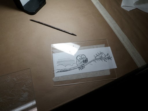
The first step that had to be taken in order to create my drypoint was to decide on what I wanted to print. As I have already stated I am not an artist so I needed something that was either very easy or that I could trace. After debating between an owl or a book I finally decided on an owl and went to Mindy to ask if she had any images of owls that I could copy in order to trace them. She gave me a book of birds and after perusing it for a while I stumbled upon the image of an owl reading...how perfect!!!! I went to Staples, copied the image, and prepared for the adventure ahead of me!

Owl behind Plexi:


The actual tracing was a lot easier than I thought it was going to be. I worked with the sharp needle/pencil like tool to create burrs...pressing at an angle and re-working the lines of the leaves and the owl to give it a bit of a rougher, homemade feel.

Burring it up (sorry for the glare):


Once the lines were all set it was time to ink up!

Owl on Plexi:


I don't actually have any pictures of the inking process because it was way too messy for that. Even for a hardened pro it is probably impossible to snap shots with ink on their hands...but for a first timer such as myself I had to leave the camera completely out of the room! I put the ink on top of the plexiglas and made sure to get it deep into the burrs and then I worked on getting it off as best as possible with a cardboard type of spatula and a ball of grainy fabric (which I can't remember the name of). Once that was done we laid the slightly moist paper down in the press and ran it through! I actually love the end result and am excited to try this process again...I mean imagine what I can do with a little practice! I am thinking I should just buy some plexiglas and the burring tool and work at it until I create an image I really feel like I need to print! Once printed you can end up with a piece of art, or just something fun, to hang up in your home! I can't decide where to put mine yet, but it is for sure going up!

End Result:

Friday, April 23, 2010

Letterpress Business Cards: A Love Story

To start this post I need to outright tell everyone that I am intrigued by and enamored with the art and technology of letterpress (as one could have suspected after my last post). Though I have long enjoyed the aesthetics of books and have even studied the history of the book in the past, I think it is fair to say that I only really began a serious study of the techniques employed in book production in the last year. In the course of this study I have fallen head over heels in love with letterpress design. Every aspect of it excites me, and even though I still have a very long way to go in my studies I have began to produce my own letterpress creations (thanks to the training and studio time I have gotten at Studio on the Square).

My second experience with letterpress was to make my Mr. and I some super awesome business cards. The first step to this process was to decide on the layout we wanted for the cards and we each went with pretty different ideas. I am not very good with measurements and the like, but it is very important to understand the basic size of a business card and measure it out before you start to lay out the card itself.

Next I set all the type by hand, which being the amateur that I am took me about four hours (I am a little ashamed of that time, but maybe I can get some bonus points because I was talking to other people in the studio while I worked). I chose to use Caslon and Caslon italic for my card and Bodoni bold for the man's. The only issue I found was that with Bodoni the 1 and the l look almost identical and since both of those components are in the Mr.'s email I had to use another type for the 1 to distinguish it from the l.

My type on Press:


After this we had to select our paper. We made a trip to New York Central and spent about an hour feeling all sorts of paper and checking the weight. The Mr. wanted a slightly off-white paper while I was thinking about getting a green or yellow. I was unable to find a color that I liked with the proper weight though and therefore let the Mr. pick out the paper for the both of us. I have to say that it was a gorgeous paper with a nice cloth-like texture to it, unfortunately (I am ashamed to admit) I forgot the name.

Once the paper was selected and the type set the next steps were to cut the paper down and print the cards. To start with I cut the paper to 8 x 11 size sheets with a regular paper cutter so that I could print four cards on each sheet. Next I ran press.

In order to run press the first piece of business was to decide on colors for the ink. I wanted green and the Mr. wanted black and so there needed to be two press runs with a cleaning of the press in-between. I started with the black ink - so I inked up and ran the press.

Inking up:


Walking the Press:


First Finished Set:


Once I had cleaned the press I went on to print my cards in green.

Rollers of Press:


Starting Press run of cards:


Second Finished Set:


Once I was done I cleaned press again and called it a day...after all this part of the process had taken me 7 hours to do.

The final step was to come back to the Studio a few days later, after the cards had dried, and cut the paper down to business card size. Again, I had to create a template of the card in order to properly measure it and again I am super bad at this stuff so I have to thank Mindy ever so much for her help with the measurements. Once these were figured out though I got on the guillotine and cut the cards down to a perfect business card size and I simply love the end result.

Guillotine:


My Card (sorry for the poor quality of the shot, I swear it is me, not the camera):


A fun fact about my card: it is has two states. After a few runs I realized that the c in "dancing queen" wasn't making a very good impression and so I had to replace it. The card above is from the first state.

Printing these cards was such an amazing learning experience for me, but more than that it was enjoyable every step of the way! I really love being able to give these out and know that they are one of a kind - made for me, by me. My Mr. has also gotten tons of compliments on his and it really fills me with an amazing sense of accomplishment.

Thursday, April 22, 2010

APHA Spring Newsletter

The APHA Spring Newsletter is out and it is just proof that I am moving up in this world! My friend and I are both listed as "New Members." These 15 minutes sure do feel great! :)

With that out of the way though, I should point out that APHA - the American History Printing Association - is a really promising organization to me. They are dedicated to the history of printing (primarily in America, but not exclusively) and when it seems to me that too many people are busy disregarding the monumental importance of this technology, it is nice to find an organization committed to keeping the practice and celebration of the art alive. So, for all you boys and girls out there who feel the same way...or you could feel differently but still love print or history or both or more...then check the site out (I especially couldn't pass up the opportunity to receive their journal Printing History).

Wednesday, April 21, 2010

The Adventure of Library Thing and I: Cataloging one Book at a Time

After years of grappling with the idea I have finally decided that I must begin the task of cataloging the Mr. and I's books. I really wanted to use Library of Congress call numbers for this because, while I know it has its issues, I needed a uniform set of rules to follow - and after trying to create my own and spending a couple of very frustrating days surrounded by books and index cards, I gave up. Since I don't have access to OCLC I decided the best way to do it would probably be to start a Library Thing catalog, and instead of subject tags put the LC call number. I am looking in WorldCat for the call numbers and then copying and pasting the info. This might not be a perfect system, but it seems to be working pretty well. Since this is such a large project and very book related I thought I might try to chronicle its progress here.

First and only fun fact of the day: I am 1 of only 6 people on Library Thing who own Benjamin Franklin, Jonathan Edwards, and the representation of American Culture!

Tuesday, April 13, 2010

Small Press Fair

I had a lovely and quite fun time visiting the Small Press Fair that was held this year in NYC. A friend and I decided to combine our interest in seeing each other and seeing books by meeting at the fair and perusing the booths together.

Entering the Fair:


All the booths were really great and had some really awesome swag that I have yet to go through thoroughly. My friend got a free cookbook among the other free books/journals that we both received.

Bag o' Swag:


One booth that was especially interesting though was the PEN one. Not only was the gentleman manning the booth contagiously enthusiastic about the organization, but Pen really did sound amazing. Their goal is to protect free speech and "celebrate literature." Both my friend and I agreed we should get involved somehow, although I know my busy schedule of work and Library School has made me lazy on taking any action so far...one more thing to do this summer! Anyone interested should definitely check out the PEN site though!

Sign from PEN booth:


Another really great booth was the Biblioteca Jorge Luis Borges from the Instituto Cervantes New York. The two men at this booth were really nice people and were more than happy to fill us in on the center and library itself. I unfortunately don't speak Spanish and I let this slip and they both said I should check out the library at least as an MLS student. They also showed us that the Institute offers classes to learn Spanish, so this place sounds really great! I would say everyone should check out both the Institute and Library, even if you don't know Spanish you are sure to be greeted by some really spectacular people who are super willing to help...they even gave us bags for our swag!

On top of the great people and swag that this fair had to offer it also had some really unique and quality books for sale. I got the coolest book that I thought at the time perhaps I should get for my niece and later found out that a friend had gotten for her niece...but I am sorry to say I can't let this one go, it is all for me!

One of the Super Duperist books ever!:


The lovely woman that I have been lucky enough to get to work with and who has been teaching me the hands-on talents of Letterpress and Book Arts, Mindy Belloff, was also there. She was selling great stationary and the like from her company Letterpress Designs and promoting the awe-inspiring reprint of the Declaration of Independence that she has done (you should check it out on her Studio on the Square site). I bought one for my dad who is a history buff and if I could have I would have bought one for myself too. She also offers classes at Studio on the Square that - if it isn't already totally obvious - I highly recommend.

So, overall this was a pleasant Fair experience and I really enjoyed learning so much about different organizations, libraries, and printing houses. I can't wait until the next one...and I will leave you with the guns of steel that guard the staircase in the building in which the fair was held.

Guns of Steel...or perhaps Iron...or Copper...or Whatever: